
Greetings, traveler!
SwiftUI ProgressView is a valuable tool for displaying progress. But sometimes, we must create something custom to gain complete control over the UI. We can create a custom progress bar with masking.
Note
By the way, we have already discussed the SwiftUI progress bar with masking. There, we discussed using an image to change a progress bar shape. You can read more about it here.
Let’s create some mock views and two @State variables:
- Progress value
- Progress bar value
We will use the second one to store progress value, calculated with a view frame.
struct ContentView: View {

    @State private var progress: CGFloat = .zero
    @State private var progressBarValue: CGFloat = .zero

    var body: some View {
        VStack {
            Text(progress, format: .percent.precision(.fractionLength(.zero)))
                .frame(maxWidth: .infinity, minHeight: 80)

            Slider(value: $progress, in: 0...1)
                .padding()
        }
        .padding()
    }

}
After that, create a new View. Here, we will use GeometryReader and two rectangles stored inside the ZStack.
var progressBar: some View {
        GeometryReader { geometry in
            ZStack {
                RoundedRectangle(cornerRadius: 16, style: .continuous)
                    .fill(.green)

                RoundedRectangle(cornerRadius: 16, style: .continuous)
                    .fill(.gray)
            }
        }
    }
Now, we need to calculate the progress bar value. We will use GeometryReader to do this.
var progressBar: some View {
        GeometryReader { geometry in
            ZStack {
                RoundedRectangle(cornerRadius: 16, style: .continuous)
                    .fill(.green)

                RoundedRectangle(cornerRadius: 16, style: .continuous)
                    .fill(.gray)
                    .mask {
                        Rectangle()
                            .offset(x: -progressBarValue)
                    }
            }
        }
    }
This value can be used to create a mask. Since we are using ZStack here, these two rectangles overlay one another. We will use a mask to partially or fully reveal one of them.
var progressBar: some View {
        GeometryReader { geometry in
            ZStack {
                RoundedRectangle(cornerRadius: 16, style: .continuous)
                    .fill(.green)

                RoundedRectangle(cornerRadius: 16, style: .continuous)
                    .fill(.gray)
                    .mask {
                        Rectangle()
                            .offset(x: -progressBarValue)
                    }
            }
            .onChange(of: progress) { _, newValue in
                progressBarValue = -geometry.size.width * newValue
            }
        }
    }
Now, we can use it. Check out the full code:
struct ContentView: View {

    @State private var progress: CGFloat = .zero
    @State private var progressBarValue: CGFloat = .zero

    var body: some View {
        VStack {
            Text(progress, format: .percent.precision(.fractionLength(.zero)))
                .frame(maxWidth: .infinity, minHeight: 80)
                .background {
                    progressBar
                }

            Slider(value: $progress, in: 0...1)
                .padding()
        }
        .padding()
    }

    var progressBar: some View {
        GeometryReader { geometry in
            ZStack {
                RoundedRectangle(cornerRadius: 16, style: .continuous)
                    .fill(.green)

                RoundedRectangle(cornerRadius: 16, style: .continuous)
                    .fill(.gray)
                    .mask {
                        Rectangle()
                            .offset(x: -progressBarValue)
                    }
            }
            .onChange(of: progress) { _, newValue in
                progressBarValue = -geometry.size.width * newValue
            }
        }
    }

}
Cool!
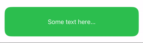
Text masking
We can also change the text color with a mask to ensure it is always visible. We will use the same approach: creating two views and revealing one with a mask.
import SwiftUI

struct ContentView: View {

    @State private var progress: CGFloat = .zero
    @State private var progressBarValue: CGFloat = .zero

    var body: some View {
        VStack {
            progressBar
                .frame(maxWidth: .infinity, maxHeight: 80)

            Slider(value: $progress, in: 0...1)
                .padding()
        }

        .padding()
    }

    var progressBar: some View {
        GeometryReader { geometry in
            ZStack {
                RoundedRectangle(cornerRadius: 16, style: .continuous)
                    .fill(.green)

                RoundedRectangle(cornerRadius: 16, style: .continuous)
                    .fill(.gray)
                    .mask {
                        Rectangle()
                            .offset(x: -progressBarValue)
                    }

                Text("Some text here...")
                    .foregroundStyle(.white)
                    .frame(maxWidth: .infinity)

                Text("Some text here...")
                    .foregroundStyle(.black)
                    .frame(maxWidth: .infinity)
                    .mask {
                        Rectangle()
                            .offset(x: -progressBarValue)
                    }
            }
            .onChange(of: progress) { _, newValue in
                progressBarValue = -geometry.size.width * newValue
            }
        }
    }

}
Conclusion
This simple example opens up opportunities for more flexible customization. You can find the source code here.