
Greetings, traveler!
When presenting text or controls over images, one of the common challenges is ensuring legibility without completely obscuring the background. A popular approach is to add a blurred overlay that fades in gradually, providing contrast for the foreground elements while preserving the visual context of the background image.
In this article, we’ll look at a SwiftUI solution that applies a bottom blurred overlay with a smooth gradient transition.
The Modifier
The implementation is wrapped in a custom ViewModifier, exposed through a convenient extension:
public extension View {
    func materialOverlay<Overlay: View>(
        @ViewBuilder overlay: @escaping () -> Overlay
    ) -> some View {
        modifier(MaterialOverlay(overlay: overlay))
    }
}This allows any view—such as an image—to receive a blurred bottom overlay simply by calling .gradientBlurOverlay { … }.
How It Works
Inside the modifier, the content is wrapped in a ZStack aligned to the bottom:
- Base content remains visible in the background.
- Blur layer: a
Rectanglefilled with.ultraThinMaterial, masked by a vertical gradient that transitions from transparent at the top to opaque at the bottom.
This gradient is key: it creates the smooth fade, so the blur doesn’t start abruptly. - Overlay view: typically text or controls that sit above the blurred area.
private struct MaterialOverlay<Overlay: View>: ViewModifier {
    let overlay: () -> Overlay
    @State private var height: CGFloat = 300

    func body(content: Content) -> some View {
        ZStack(alignment: .bottom) {
            content

            Rectangle()
                .fill(.ultraThinMaterial)
                .mask {
                    LinearGradient(
                        colors: [
                            .clear,
                            .black.opacity(0.1),
                            .black.opacity(0.7),
                            .black.opacity(0.9),
                            .black,
                            .black,
                            .black,
                            .black
                        ],
                        startPoint: .top,
                        endPoint: .bottom
                    )
                }
                .frame(height: height)

            overlay()
                .onGeometryChange(for: CGSize.self) { geometry in
                    geometry.size
                } action: { newValue in
                    height = newValue.height
                }
        }
    }
}The gradient mask ensures that the blur gently blends into the image, instead of forming a hard edge.
Dynamic Height
The modifier measures the height of the overlay content and adjusts the blurred area accordingly. This ensures that the blur always covers exactly the space needed for the foreground content, whether it’s a short label or a taller stack of text.
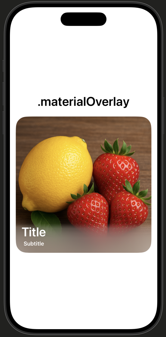
Example Usage
Here’s how it looks in practice:
struct MyView: View {
    var body: some View {
        Image(.berries)
            .resizable()
            .scaledToFit()
            .gradientBlurOverlay {
                VStack {
                    Text("Title")
                        .foregroundStyle(.white)
                        .font(.largeTitle)
                        .fontWeight(.semibold)

                    Text("Subtitle")
                        .foregroundStyle(.white)
                        .font(.subheadline)
                        .fontWeight(.semibold)
                }
                .frame(maxWidth: .infinity, alignment: .leading)
                .padding()
                .padding(.top)
            }
            .clipShape(.rect(cornerRadius: 30))
            .padding()
    }
}

#Preview {
    MyView()
}The text remains crisp and legible against the blurred gradient, while the background image is still visible underneath.
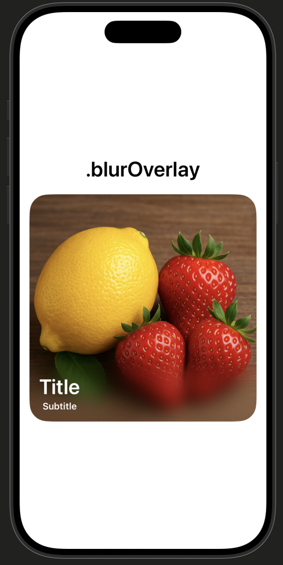
Blur overlay
Another way is to use the blur modifier. There are a couple of nuances:
- You need to use the same content, but with an overlay mask.
- It is necessary to increase its size so that the blur completely fills the
View.
private struct BlurOverlay<Overlay: View>: ViewModifier {
    let overlay: () -> Overlay
    @State private var height: CGFloat = 300

    func body(content: Content) -> some View {
        ZStack(alignment: .bottom) {
            content
                .overlay {
                    content
                        .allowsHitTesting(false)
                        .blur(radius: Constants.blurRadius)
                        .scaleEffect(Constants.scaleValue)
                        .mask {
                            VStack {
                                Spacer()
                                LinearGradient(
                                    colors: [
                                        .clear,
                                        .black.opacity(0.1),
                                        .black.opacity(0.7),
                                        .black.opacity(0.9),
                                        .black,
                                        .black,
                                        .black,
                                        .black
                                    ],
                                    startPoint: .top,
                                    endPoint: .bottom
                                )
                                .frame(height: height + Constants.additionalPadding)
                            }
                        }
                }


            overlay()
                .onGeometryChange(for: CGSize.self) { geometry in
                    geometry.size
                } action: { newValue in
                    height = newValue.height
                }
        }
    }
}Now, we can add a new view modifier:
public extension View {
    func blurOverlay<Overlay: View>(
        @ViewBuilder overlay: @escaping () -> Overlay
    ) -> some View {
        modifier(BlurOverlay(overlay: overlay))
    }
}Alternatives for a Softer Transition
If you want to go further and create an even smoother transition, there are third-party libraries worth exploring:
- VariableBlur This approach uses CAFilter to apply variable blur intensity across the view. However, note that CAFilter isn’t a public API in SwiftUI/UIKit. While it works in practice, using it comes with risks — future iOS updates may break the functionality or lead to App Store review issues. Use at your own discretion.
- Glur This library implements a blur effect using a custom Metal shader.
These tools can help you achieve a more natural, variable blur effect compared to what’s possible with SwiftUI’s built-in .material system.
Conclusion
A bottom blurred overlay with a smooth gradient provides a practical and visually pleasing way to present text over images. By gradually increasing opacity in the blur mask, the transition feels natural and avoids the sharp boundary that often distracts users.
This approach can be applied to any SwiftUI view and easily reused thanks to the custom modifier.
GitHub (Swift Package): https://github.com/Livsy90/GradientBlurOverlay/tree/main