
Greetings, traveler!
SwiftUI’s fullScreenCover modifier is a powerful tool for presenting views that take over the entire screen, such as modals, onboarding flows, or detailed content views. However, developers often want more control over the presentation animation—for example, how to make the full-screen cover fade in smoothly rather than relying on the default slide-up behavior.
In this article, we’ll walk through a solution that enables any custom transition for a full-screen cover using a custom view modifier. By the end, you’ll have a reusable tool to enhance your SwiftUI presentations with polished animations.
The Challenge with fullScreenCover
The fullScreenCover modifier in SwiftUI is straightforward to use: you bind it to a boolean value, and when that value becomes true, the specified content is presented over the entire screen. By default, it animates with a slide-up transition. However, if you want a different effect—like a fade-in using an opacity transition—SwiftUI doesn’t provide a built-in way to customize this directly within the fullScreenCover modifier.
This limitation prompts us to get creative. We need a way to apply a custom transition and animation to the content of the full-screen cover while still leveraging the modifier’s full-screen presentation capabilities.
The Solution: A Custom Full-Screen Cover Extension
To solve this, we’ll extend SwiftUI’s View protocol with a customFullScreenCover method. This method will use a ViewModifier called CustomFullScreenCoverModifier to handle the presentation logic, allowing us to specify both the transition and animation. Here’s the complete code:
import SwiftUI

public extension View {
    func customFullScreenCover<Content: View>(
        isPresented: Binding<Bool>,
        transition: AnyTransition = .opacity,
        animation: Animation = .easeInOut,
        @ViewBuilder content: @escaping () -> Content
    ) -> some View {

        modifier(
            CustomFullScreenCoverModifier(
                isPresented: isPresented,
                transition: transition,
                animation: animation,
                presentedView: content
            )
        )
    }
}

private struct CustomFullScreenCoverModifier<PresentedView: View>: ViewModifier {
    @Binding var isPresented: Bool
    let transition: AnyTransition
    let animation: Animation
    @ViewBuilder let presentedView: () -> PresentedView

    @State private var isPresentedInternal = false
    @State private var isShowContent = false
    @Environment(\.scenePhase) private var scenePhase
    @State private var isActive = true

    func body(content: Content) -> some View {
        content
            .fullScreenCover(isPresented: $isPresentedInternal) {
                Group {
                    if isShowContent {
                        presentedView()
                            .transition(transition)
                            .onDisappear {
                                guard scenePhase != .background, scenePhase != .inactive, isActive else { return }
                                isPresentedInternal = false
                                isPresented = false
                            }
                    }
                }
                .onAppear {
                    isShowContent = true
                }
                .presentationBackground(.clear)
            }
            .transaction {
                $0.disablesAnimations = true
                $0.animation = animation
            }
            .onChange(of: isPresented) { _, newValue in
                if newValue {
                    isPresentedInternal = true
                } else {
                    isShowContent = false
                }
            }
            .onChange(of: scenePhase) { _, newValue in
                switch newValue {
                case .background, .inactive:
                    isActive = false
                case .active:
                    DispatchQueue.main.asyncAfter(deadline: .now() + 0.5) {
                        isActive = true
                    }
                @unknown default:
                    break
                }
            }
    }
}
Breaking Down the Code
Let’s explore how this solution works step by step:
CustomFullScreenCoverModifier:
CustomFullScreenCoverModifiermanages the presentation logic using two@Statevariables:isPresentedInternal: Controls the underlyingfullScreenCoverpresentation.isShowContent: Determines when to display the content with the specified transition.
- Key Logic:
- The
fullScreenCovermodifier is bound toisPresentedInternal. - Inside the full-screen cover, a
Groupconditionally shows thepresentedViewonly whenisShowContentistrue. This allows the transition (e.g., fade-in) to apply to the content. - On appearance (
onAppear),isShowContentis set to true, triggering the transition. - On disappearance (
onDisappear), bothisPresentedInternaland the externalisPresentedare reset tofalse. - The
presentationBackgroundis set to.clearto ensure a transparent background. - A transaction disables default animations for
fullScreenCoverand applies the custom animation. - The
onChangehandler syncs the externalisPresentedbinding:- When
isPresentedbecomestrue,isPresentedInternalis set totrueto show the cover. - When
isPresentedbecomesfalse,isShowContentis set tofalseto trigger the dismissal transition.
- When
- Checking the
scenePhaseallows us to prevent dismissing when View disappears.
- The
This approach separates the full-screen cover’s presentation from the content’s transition, allowing us to animate the content as desired.
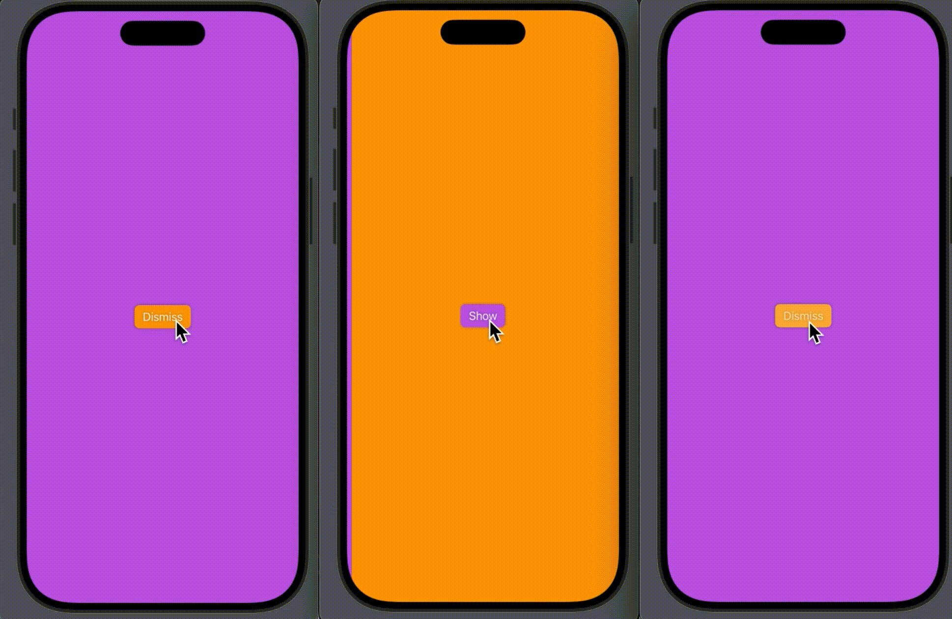
Example
Here’s an example of how to use customFullScreenCover in your SwiftUI app:
struct ContentView: View {
  @State private var isPresented = false

    var body: some View {
        Button("Show") {
            isPresented = true
        }
        .buttonStyle(.borderedProminent)
        .tint(.purple)
        .shadow(radius: 2)
        .frame(maxWidth: .infinity, maxHeight: .infinity)
        .background(.orange)
        .customFullScreenCover(isPresented: $isPresented) {
            ChildView(isPresented: $isPresented)
        }
  }
}

struct ChildView: View {
  @Binding var isPresented: Bool

  var body: some View {
    VStack {
      Button("Dismiss") {
          isPresented = false
      }
      .buttonStyle(.borderedProminent)
      .tint(.orange)
      .shadow(radius: 2)
      .frame(maxWidth: .infinity, maxHeight: .infinity)
      .background(.purple)
    }
  }
}
Conclusion
Adding custom effects to a full-screen cover presentation can make transitions more interesting. Try experimenting with different transitions (like .scale or .asymmetric) and animations to find the perfect fit for your app’s design. By the way, you can integrate this code into your project via this Swift Package.